Shading and Highlights
-- -- -- -- -- -- -- -- -- --
-- -- -- -- -- --
The Atomic Guide to Basic
Gimp Stuff
Well, you've picked your colors and
you want to emphasize things with shading and highlights -- shadows and
shine from a light source. Well, there are plenty of ways to
do it, and I'll show you three. But first, a word about
colors! Skip on if you
already
know this stuff.
Computer Colors - the HSV system
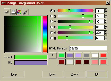 The Gimp defines colors by:
- Hue rainbow shade
- Saturation how pale / white
- Value how dark / black
(also called Luminosity)
They're labeled H, S, and V on the sliders shown here in the Color Picker.
The R-G-B sliders adjust Red, Green, and Blue directly from 0 to 255. Play with everything to see what changes!
This shows a setting for a bright, slightly Yellow shade of Green: Hue = 111, Saturation = 72%, Value = 90%.
The "HTML Notation" box is the web code for that color, usually prefixed by a # when written. Here, the color is #58E53F. #000000 is Black, #FFFFFF is White. The Hex numbers (0-9,A-F) are in pairs for Red, Green, and Blue in that order. You can type in a specific color code as needed. More on this later.
Hue is a scale from 0 to 360 going:
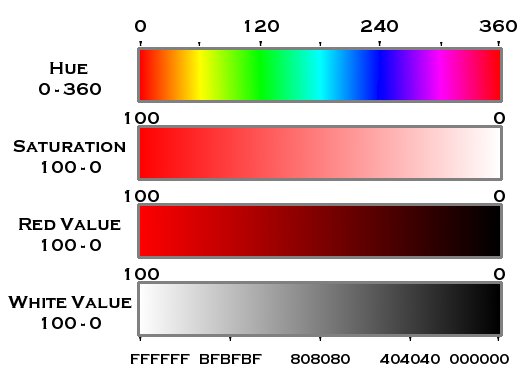
0-Red
60-Yellow
120-Green
180-Cyan
240-Blue
300-Magenta
360-Red again
Saturation ranges from 0% (all pale, no color) to 100% (all color, no white).
Value (also called Luminosity) is also 0-100%. 0% is no brightness (black), 100% is all color. Think of Saturation as a color scale, and Value as a gray scale.
When you've got a color you want to highlight or shade, you'll be wanting to add or remove darkness (Value) -or- add or remove brightness (Saturation). The trick is when you have a bright color already, how do you make it much "brighter"? Answer: You start to drop Saturation and make it paler!
Color Steps
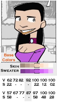 Here's
an example image with a set of color steps. The base colors
are
of Tina's skin and sweater are marked by the brackets on the steps.
Below them are the Value and Saturation numbers for those
color
steps. The colors were darkened by dropping Value by
intervals of
10, while Saturation remained the same.
Here's
an example image with a set of color steps. The base colors
are
of Tina's skin and sweater are marked by the brackets on the steps.
Below them are the Value and Saturation numbers for those
color
steps. The colors were darkened by dropping Value by
intervals of
10, while Saturation remained the same.But, when brightening, you run into the top of the Value scale -- that is, the color is as bright as it can be! So, to make it lighter, you have to drop Saturation to make it pale. Again, here in steps of 10. Note that the lightest Skin color is almost pure white.
By making a layer to hold the color steps, you can quickly change shades by using the Sample tool and painting to suit. The step interval can be as many and as large as you want depending on how you want to do things. Note that things tend to darken quickly, but get pale/light more slowly -- especially if your base color is light to begin with. This also depends on your eyes and your monitor settings. Your Millage May Vary.
Blur and Smear
Ok -- Here's Tina again with her
Base Colors and
then some shadings. By studying a picture of a real face in a
similar posture and desired lighting, I settled on the positions in the
High & Low panel for the shades and highlights. After
that,
it was a choice of what to do to those colors using various tools and
filters to modify things.
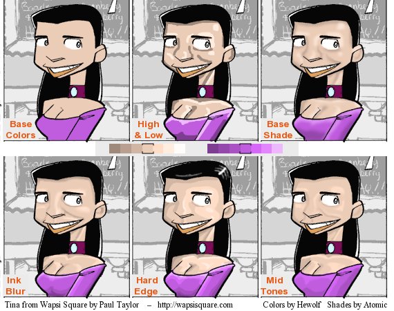
Base Shade: This was done with paintbrush which produces soft edges between the colors. The base colors were on their own layer and the hi/low lights were a separate layer. Then the hi/low lights were blurred 5px using Gaussian Blur in the Filters, Blur menu.
Ink Blur: The hi/low lights were again on their own layer, but the Ink tool was used for a harder edge between colors. The Blur/Sharpen tool and Smudge tools were used to blend where I wanted a softer transition between shades.
Hard Edge: Paintbrush again, but no blurring or smudging to mix colors. I also added a white highlight to the hair.
Mid Tones: A combination of blurs and smears using only the shades next to the base shade for only 3 tones.
Note that for any of these to work, you need to have figured out where your light is coming from (for shadows and shines) and the anatomy being enhanced by these lights. Clothing folds, hair shines, and other details are all revealed by the light. Likewise, the color range and depth also depend on how you want to enhance things. Noir style has large ranges and sharp contrasts. Dream sequences may be soft pastels and gentle color transitions. Have a plan before you start adding highlights!
Remember -- You can set the tool Opacity to, say 20% or so, and gently build up the colors in an area (Airbrush is good for this). Likewise, you can change the layer Opacity to less than 100% to soften things rather than having to redraw. Using the fuzzy brushes and low Opacity on the Blur/Smear tools also help create gentle transitions.
Gray Shading with Multiply and
Divide
This shading method makes use
of Layer and Tool properties. Usually, the
colors you add to a layer are on their own and do not interact with
other layers. If the layers above have transparent areas, you
"see through" those parts onto that layers colors -- just like drawing
on clear acetates as explained back in The Basics section.
However, you also have the ability to make the layers interact by the Mode setting for either the whole layer, or just for the tool you are using! The Mode setting is the big button labeled "NORMAL" at the top of the layer stack, just above the Opacity slider. The drawing tools also have Mode and Opacity settings.
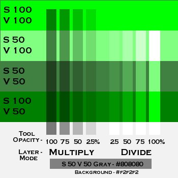 Here's how it works: 50% Gray is in the middle of the color
scale. The Multiply setting pushes the Value (Black amount) lower toward
Black. Divide raises the Value making it more White.
You control the amount of change with the Opacity setting on
your paint tool. Try 15-20% to start. Repeated
brush strokes over one spot will push the effect further.
Note that the darkest you can go is one-half the Value you started with. You can push it darker by using 100% Black instead of 50% Gray. Again, repeated strokes (or higher Opacity) will make it darker faster.
There are two ways you can use this method:
The tool color, of course, would be 50% Gray - #808080, or darker to force more Black.
Thanks to Wapsi Forum member Azrael_Rose for explaining this technique to me!
However, you also have the ability to make the layers interact by the Mode setting for either the whole layer, or just for the tool you are using! The Mode setting is the big button labeled "NORMAL" at the top of the layer stack, just above the Opacity slider. The drawing tools also have Mode and Opacity settings.
 Here's how it works: 50% Gray is in the middle of the color
scale. The Multiply setting pushes the Value (Black amount) lower toward
Black. Divide raises the Value making it more White.
You control the amount of change with the Opacity setting on
your paint tool. Try 15-20% to start. Repeated
brush strokes over one spot will push the effect further.
Here's how it works: 50% Gray is in the middle of the color
scale. The Multiply setting pushes the Value (Black amount) lower toward
Black. Divide raises the Value making it more White.
You control the amount of change with the Opacity setting on
your paint tool. Try 15-20% to start. Repeated
brush strokes over one spot will push the effect further.Note that the darkest you can go is one-half the Value you started with. You can push it darker by using 100% Black instead of 50% Gray. Again, repeated strokes (or higher Opacity) will make it darker faster.
There are two ways you can use this method:
1. Create a Multiply
layer and a Divide layer
above your
color layers and set the layer mode.
This gives you more
flexibility and does not damage your original color layers.
2. Draw on your color layer with the tool mode set to Multiply or Divide.
If I do this, I do it on a duplicate of the original base color layer so I have a fall back.
2. Draw on your color layer with the tool mode set to Multiply or Divide.
If I do this, I do it on a duplicate of the original base color layer so I have a fall back.
The tool color, of course, would be 50% Gray - #808080, or darker to force more Black.
Thanks to Wapsi Forum member Azrael_Rose for explaining this technique to me!
Saturation Shading with Screen
and Burn
The previous method adds and removes
Black from your image. What if you want to enhance or soften
the color amount - Saturation - without changing the gray level?
You can do it with Screen and Burn.
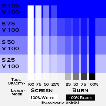 The difference is that you
have to use 100% White for the Screen layer, and 100% Black for the
Burn layer. As above, the White/Screen setting pushes the
color value towards low saturation (paler).
The Black/Burn setting pushes the color to higher
saturation (more color) instead
of toward Black.
Note that at the bottom of this image, you see gray and black against the White background, because Black is 0% Value even at 100% Saturation.
 The difference is that you
have to use 100% White for the Screen layer, and 100% Black for the
Burn layer. As above, the White/Screen setting pushes the
color value towards low saturation (paler).
The Black/Burn setting pushes the color to higher
saturation (more color) instead
of toward Black.
The difference is that you
have to use 100% White for the Screen layer, and 100% Black for the
Burn layer. As above, the White/Screen setting pushes the
color value towards low saturation (paler).
The Black/Burn setting pushes the color to higher
saturation (more color) instead
of toward Black.Note that at the bottom of this image, you see gray and black against the White background, because Black is 0% Value even at 100% Saturation.
Layer Management
Ok -- Now that you've got tons of
colors and shades and whatever going on, you might want to consider
making life simpler! Sooner or later, you are either going to
make an Oopsie!, or decide that you really didn't want that,
you want something else instead. Enter layer management!
For what I'm doing, I find it very helpful to keep separate layers for original sources, modified originals, Inks, feature colors, actor colors, and supporting colors. Eyes, skin, clothing items, props, backgrounds, hair -- all get their own layers. Hair, for example, can get tons of shading, but I use a copy of the base shade to fiddle with. My grays are on separate multiply and divide layers, as are many of the screen and burn layers.
The Ink layer is on top of the stack, and the others according to how they interact -- clothing above skin layers and so on. Multiply/Divide and Screen/Burn layers are under the Ink and above the color layers. Any modifications to the ink layer are done on a duplicate. The original and background color layers at the bottom
Remember -- all the different modes can be applied to the tool, or to the layer, or both, and you can change the opacity of everything. More layers gives you more flexibility! Drat -- the darks are too dark -- lower opacity to fix! Bah -- what was the original skin color? Check the base layer. Too much blending on the face tones? Switch to multiply and show the base layer with lower opacity! And of course, all the different ways to blur, smear, and blend.
A Last Tip: Keep Transparency
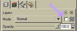 The Keep Transparency check box is a layer setting which, when checked, PREVENTS you from coloring
transparent areas!
The Keep Transparency check box is a layer setting which, when checked, PREVENTS you from coloring
transparent areas!If you've just copied and pasted or duplicate a layer and you can't seem to draw on that layer, check the Keep Transparency box -- it may be on.
Say I want to do a lot of work on a hair layer. The only thing on that layer is the hair color in the Ink Layer shape of the hair area. By selecting Keep Transparency, I can scribble to my hearts content without having anything spill over outside the lines, because it won't let me draw on the transparent areas, just the colored part. Simple, no? You can also do this by using the Select tool, but then you have to put up with the blinky dotted line.
Be sure to check out the Links to Other Guides for good stuff on these and other methods!
The Next Step -->
Scanning Stuff